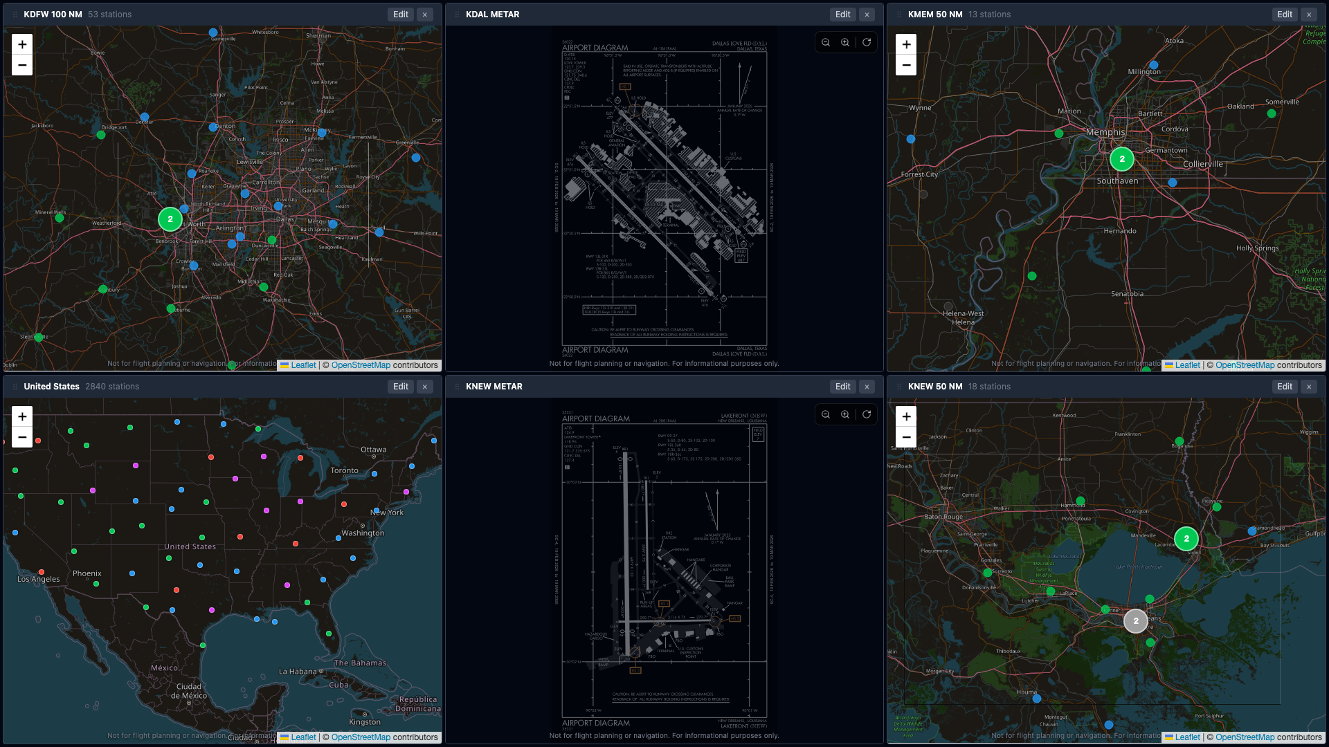
Build the briefing wall you actually want — multiple panes, your airports, animated winds, and the FAA diagrams you'd otherwise be hunting for in three browser tabs.
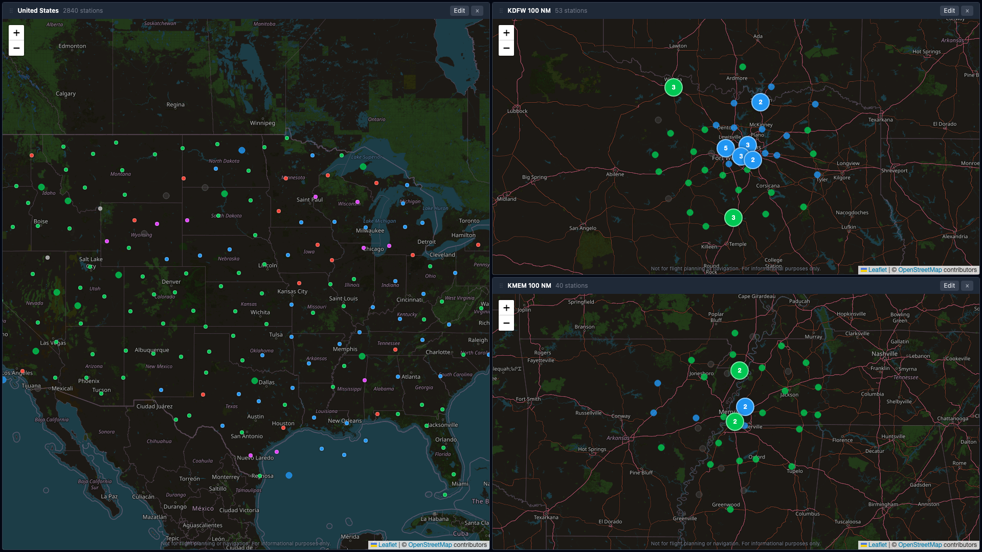
Every station and every map cluster colored by current category — VFR MVFR IFR LIFR — so you read the briefing wall by pattern, not by text.
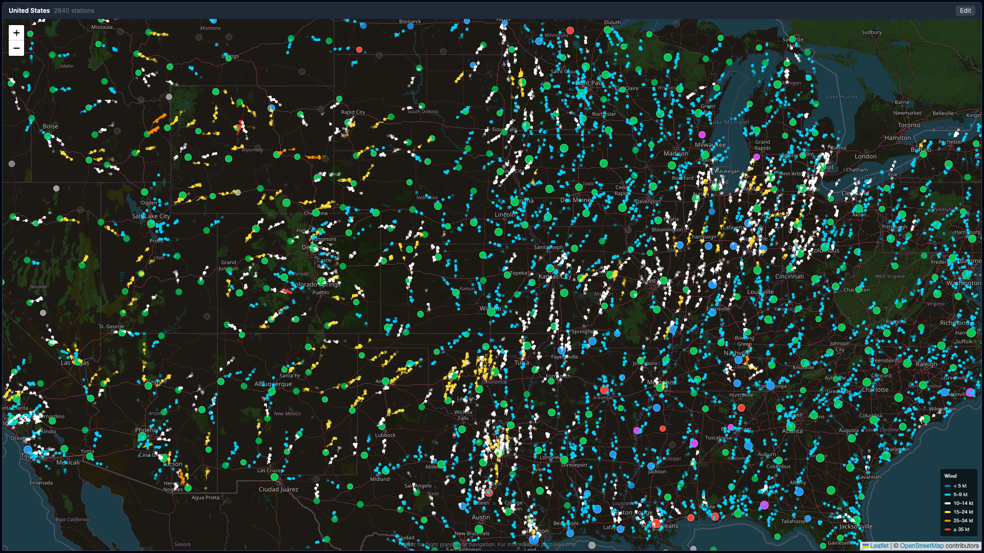
Wind speed and direction at every METAR-reporting station, animated in real time over a map. Way more intuitive than 50 strips of raw text.
Drop a dedicated pane for any airport. Full decoded METAR, crosswind component, airport diagram, trend chart, runway frequencies — all in one tile.
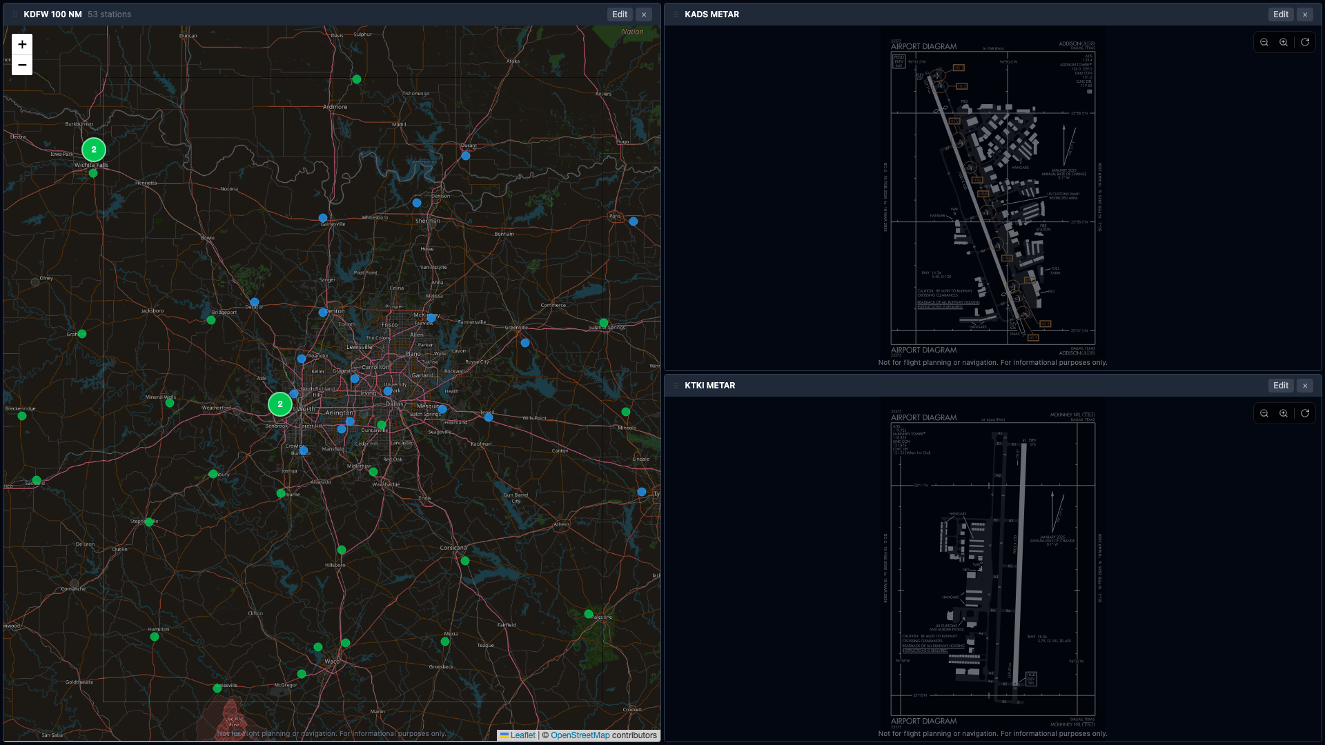
Up to 6 panes. Maps, regional clusters, METAR detail, country overview — mix and match.
Save unlimited dashboards. Share by link — anyone with the URL sees your exact layout.
Pulled from d-TPP. Auto-rotated to your viewing orientation. Cached for offline-ish reliability.
For airports without an FAA diagram, we draw runways from geographic endpoints — to scale and oriented correctly.
Per-runway crosswind and headwind components, computed live from the current METAR wind.
Visibility, ceiling, and wind over the last hours. See conditions improving or going to hell at a glance.
If a station has no current METAR: try the TAF, then nearest reporting station within 30 NM. Always something to look at.
Anything over 65 minutes old is flagged red with "STALE" — wind animations suppressed, "BEST" runway badge hidden.
Native Android TV / Google TV and Fire TV apps. Pair from your phone, dashboard sticks across reboots.
Open the app, build a dashboard, share it with your hangar buddies. If it's not for you, no harm done.